Client
RAISU
Services
BRANDING
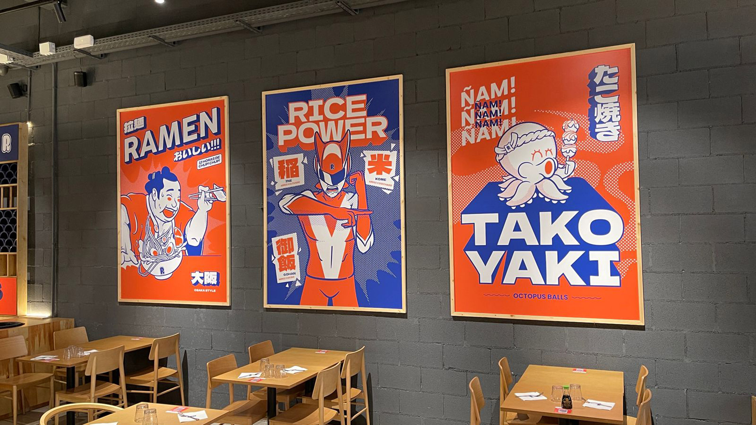
SCENIC
Sector
FOOD & BEVERAGE
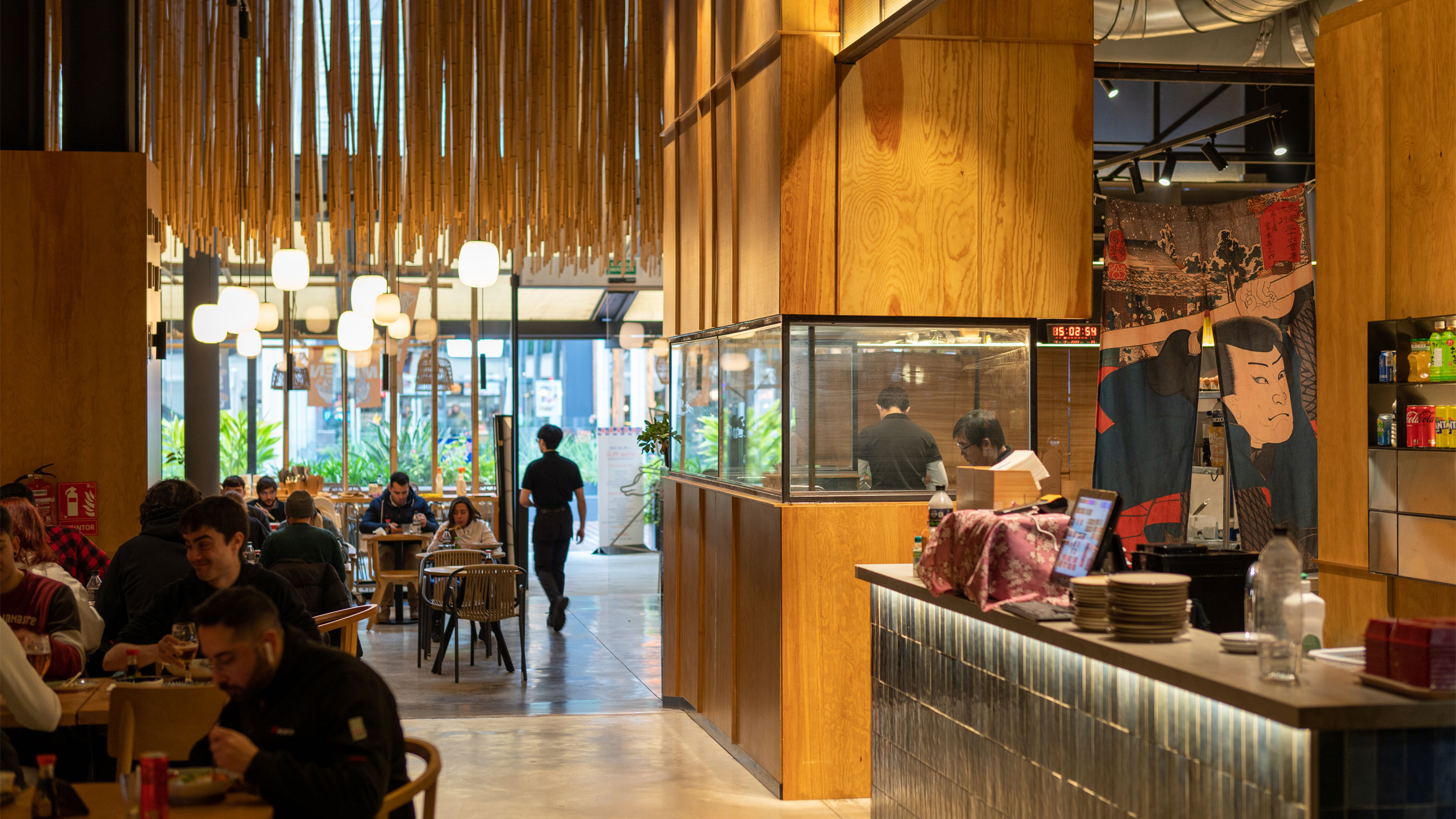
A shopping center in a city like Barcelona is a very particular context for a restaurant. The number of gastronomic offers the restaurant will have to compete with, the profile of the audience, the timing, and the duration of consumption are elements to consider when creating the visual identity and communication.
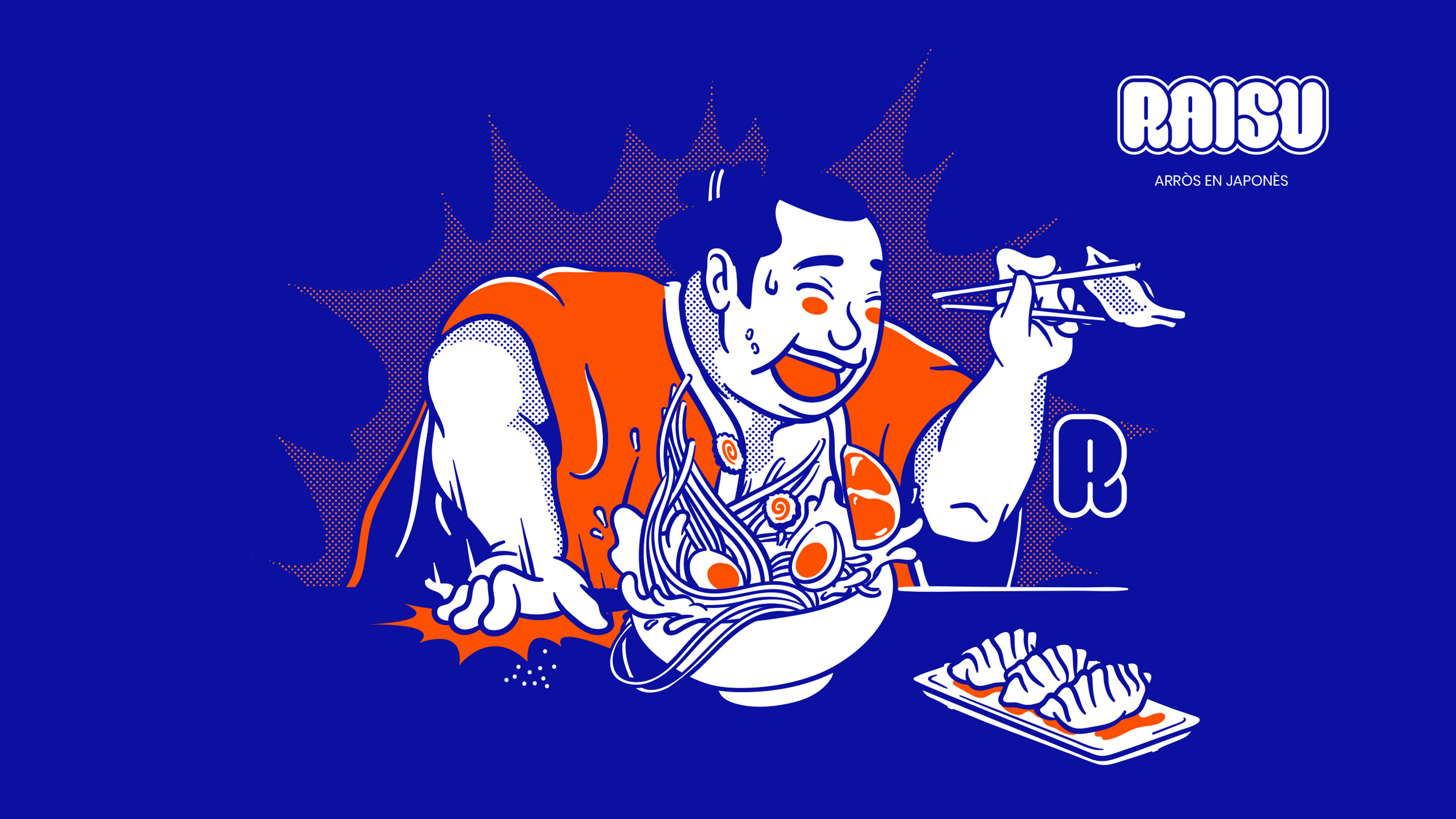
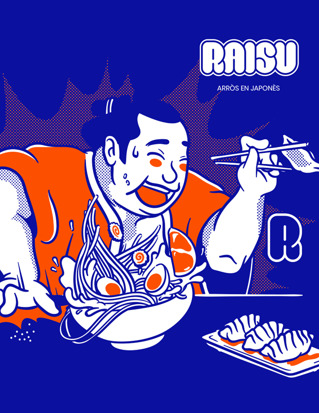
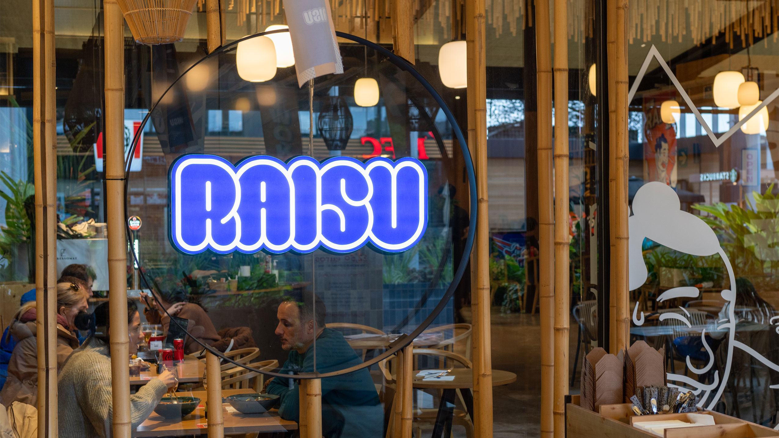
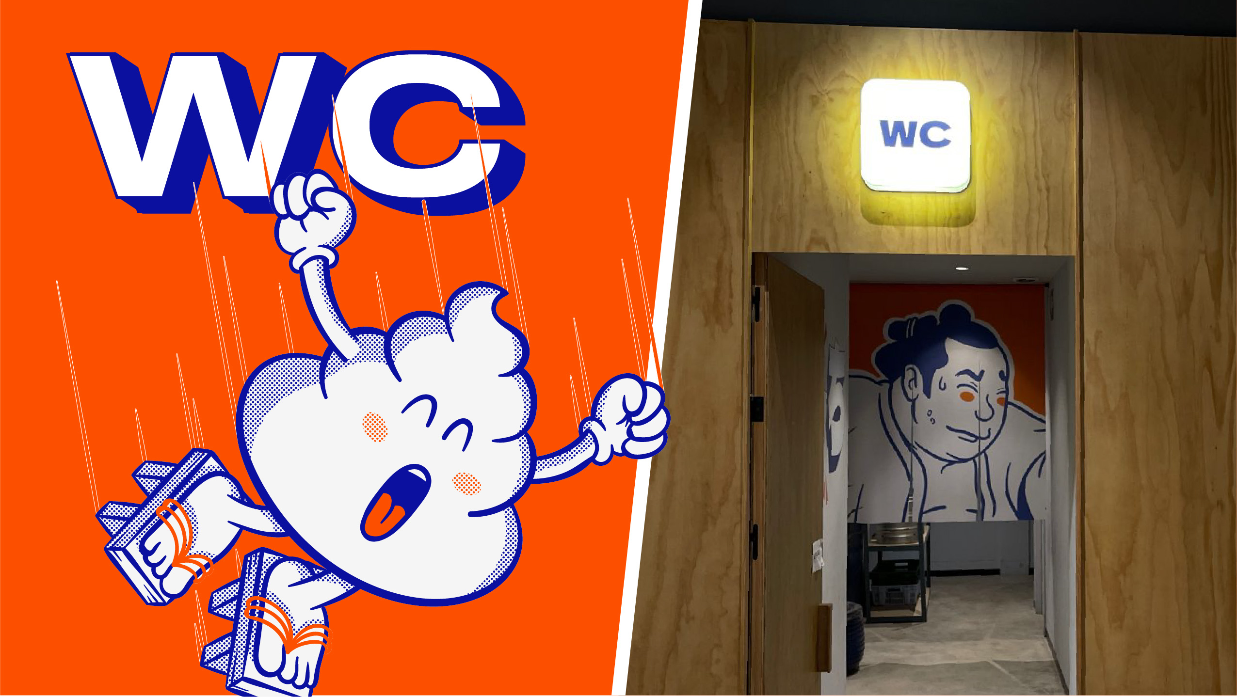
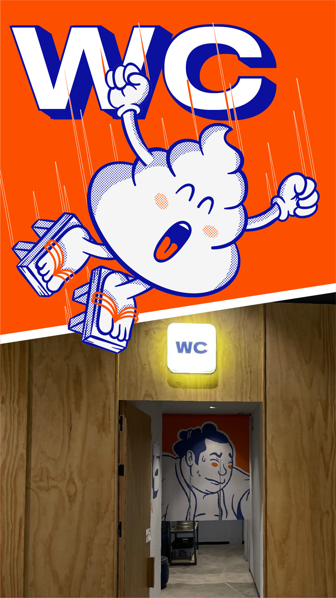
Raisu is the phonetic expression of the word rice in Japanese. We were looking for a word that was easy to pronounce but with Asian reminiscences. For the visual identity and brand expression, we opted for striking and kinetic style illustrations, a color scheme where electric blue stands out, a typographic treatment with volume, and a humorous tone throughout.
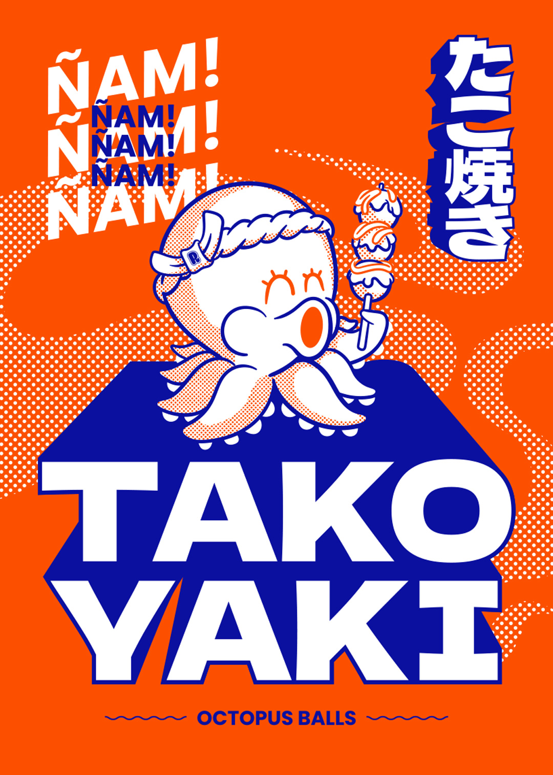
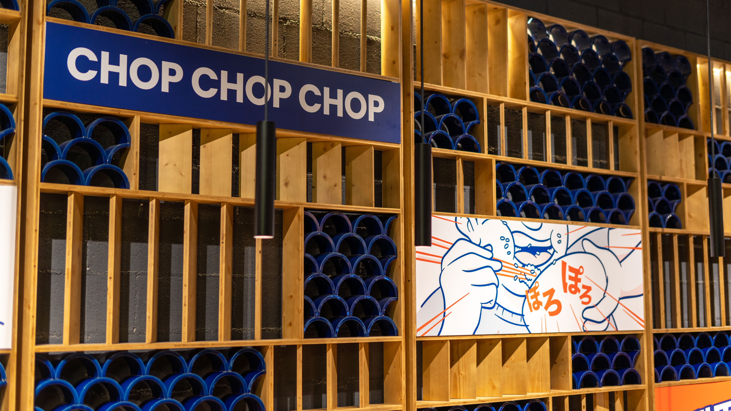
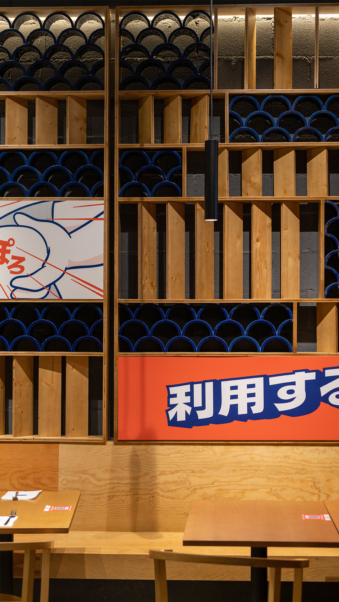
The scenic branding with a series of graphics deployed throughout the space represents part of the Japanese imaginary world of manga and animated series, such as, with all due respect, Dr. Slump by Akira Toriyama.
Exercises in anthropomorphism like the smiling poop or an octopus with eyes and a mouth more characteristic of a person than a cephalopod, warriors from imaginary special forces, mythological monsters, sumo wrestlers, and an uncontrollable urge to recreate dishes and ingredients of all kinds through drawing.


Copyright 2024 KNOCK BRAND DESIGN © | Legal notice | Cookies Policy | Privacy Policy
Las Cookies Necesarias son absolutamente esenciales para que el sitio web funcione correctamente. Esta categoría solo incluye cookies que garantizan funcionalidades básicas y características de seguridad del sitio web. Estas cookies no almacenan ninguna información personal.
| Cookie | Description |
|---|---|
| cookielawinfo-checkbox-necessary | Cookie propia, se utiliza para almacenar el consentimiento del usuario para las cookies en la categoría "Necesarias". |
| cookielawinfo-checkbox-non-necessary | Cookie propia, se utiliza para almacenar el consentimiento del usuario para las cookies en la categoría "No Necesarias". |
| PHPSESSID | Cookie propia, se utiliza para permitir que las variables de SESIÓN sean guardadas en el servidor web. Esta cookies es esencial para el funcionamiento de la web. |
| viewed_cookie_policy | Cookie propia, se utiliza para almacenar si el usuario ha dado su consentimiento o no para el uso de cookies. No almacena ningún dato personal. |
| wordpress_logged_in_ | Cookie propia, se activa después de iniciar sesión con una cuenta de usuario, se utiliza para indicar cuando se ha conectado y quién es el usuario activo. |
| wordpress_sec_ | Cookie propia, se utiliza como clave para controlar el acceso de un usuario al servicio de WordPress. |
| wordpress_test_cookie | Cookie propia, se utiliza para comprobar si las cookies están habilitadas en el navegador de los usuarios. |
Las cookies No Necesarias pueden no ser particularmente necesarias para que el sitio web funcione y se utilizan específicamente para recopilar datos personales del usuario a través de análisis, anuncios y otros contenidos integrados. Es obligatorio informar de su utilización y obtener el consentimiento del usuario sobre su uso.
| Cookie | Description |
|---|---|
| cli_user_preference | Cookie propia, se utiliza para registrar si el usuario ha consentido o no el uso de cookies. No almacena ningún dato personal. |
| CookieLawInfoConsent | Cookie propia, se utiliza para almacenar el estado de consentimiento de cookies del usuario. |
| test_cookie | Cookie de terceros gestionada por DoubleClick de Google, se utiliza para verificar si el navegador del visitante acepta cookies. |
| _ga | Cookie de terceros gestionada por Google Analytics, se utiliza para calcular los datos de visitantes, sesiones, campañas y realizar un seguimiento del uso del sitio para el informe de análisis del sitio. Las cookies almacenan información de forma anónima y asignan un número generado aleatorio para identificar visitantes únicos. |
| _gat_ | Cookie de terceros gestionada por Google Analytics, se utiliza para limitar la cantidad de datos registrados por Google en sitios web de alto volumen de tráfico. |
| _gid | Cookie de terceros gestionada por Google Analytics, se utiliza para almacenar información sobre cómo los visitantes usan un sitio web y ayuda a crear un informe analítico de cómo está funcionando el sitio web. Los datos recopilados, incluido el número de visitantes, la fuente de donde provienen y las páginas, se muestran de forma anónima. |